101
Grid-Based Web App
Summary and Objective
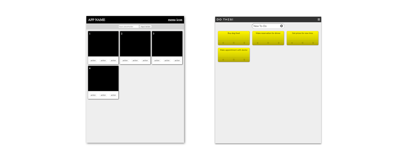
For this exercise you will modify a grid-based template by customizing the style, content, and icons–building on your intuition about HTML/CSS and patterns of user interface design. Design this app as a To-Do List application. You can refine the purpose and theme subtly, but staying with the To-Do theme will make things easier in the next exercise using Javascript. Your application will not be dynamic yet (that’s where Javascript comes in), but you can carefully create the look and feel with HTML, CSS, and Icons.
References
In addition to w3schools and the Mozilla reference, CSS Tricks provides a great reference for using CSS grids.
Instructions
1 - Get the Template Code
Fork (copy) the template code on repl.it found here.
2 - Locate and Experiment with Grid Properties in CSS
CSS grids identify two important elements, a container and the items it holds. There are a lot of possibilities with grids, but we are keeping it simple to start with.
The template code uses CSS grid properties in three places—the navigation bar, the collection of items in the main section, and the group of buttons on each item. If you look at the CSS selectors .nav-bar, .collection, and .item-actions, you will find display: grid and a grid-template-columns property. The grid-template-columns property defines how many columns to create and the relative sizes. Find the property shown below that is applied to the .collection element, and try making some changes to see what happens.
grid-template-columns: 1fr 1fr 1fr;
You can change the number of columns to two using 1fr 1fr, or make the first column larger than the other two with 2fr 1fr 1fr. You will also notice the grid-gap property. Change the gap size and see the effect.
Also, at the bottom of your CSS file you will find the code shown below.
@media only screen and (max-width: 600px) {
  .collection {
    grid-template-columns: 1fr;
  }
}
This allows your application to recognize when the browser is 600 pixels wide or less. If it is, then the number of columns in the collect is reduced to one. This makes it mobile friendly.
Use the reference links towards the top of this document to investigate other things you can do with CSS grids.
3 - Link the Font Awesome Icon Library
The Font Awesome library of icons is a great resource for adding icons to your web apps. First we need to link the style sheet in your HTML file by adding the following line inside the head element.
<link href="https://use.fontawesome.com/releases/v5.7.2/css/all.css" rel="stylesheet">
Once you have linked this style sheet you are ready to use the icons. You can search the icon gallery and copy the appropriate HTML element, like the star icon shown below, to include it in your page.
<i class="far fa-star"></i>
You will notice that the grayed out icons on Font Awesome are premium icons that you would have to pay for, but there are plenty of useful free icons you can use.
4 - Add Icons to Your Interface
Add at least three unique icons to your application. You may choose to let the icons stand alone or use them with a text description.
5 - Style the Application as You Wish and Insert Content
Continue to style the application as you wish according the the theme and purpose of your application, and provide enough content in the list of items to demonstrate a realistic view of what the application would look like with a fully functioning program and database.
To summarize, make at least the following additions or changes.
- Provide an app name appropriate for the theme and purpose of the application concept.
- Use at least one custom font, like we have done before using Google Fonts.
- Change the color scheme of the application.
- Update the sizing, grid spacing, number of columns, and break-points (for mobile view width) for the collection of items.
- Incorporate at least three unique icons.
- Provide content that gives a realistic feel for the application theme and purpose.